Data Driven Sites and Dashboards
data, dashboards, website design
TSD specializes in creating interactive data dashboards that empower users to explore complex data sets. These customizable dashboards are designed for various devices, and they incorporate dynamic graphs and charts to visualize data. TSD’s dashboards can be integrated into existing websites and are cost-effective, operating on free-tier platforms. TSD can also work with a client’s existing vendors to ensure smooth integration with their data infrastructure.
Data Dashboards
At TSD, we specialize in creating interactive “sandbox” dashboards that empower users to explore and analyze complex data sets with ease. Our user-friendly designs enable stakeholders to engage with your database across various variables and dimensions, allowing them to create customized search criteria tailored to their specific needs. This innovative approach provides organizations with valuable insights, helping them make informed decisions based on large, intricate datasets.
Tailored to Your Needs
We understand that different devices serve different purposes, which is why TSD offers fully tailored dashboard designs optimized for various screen sizes, including desktops, tablets, and mobile devices. Our customization options allow clients to highlight the most pertinent information for their target audience, ensuring the dashboard remains relevant and useful in diverse contexts, such as tradeshow displays or internal reporting.Visualize Data
Our dashboards incorporate dynamic graphs and charts that transform raw data into compelling visual narratives. For example, we have developed data dashboards illustrating trade relationships between all 435 congressional districts in the USA and South Korea, as well as dashboards analyzing over one million data points to generate insightful graphical information. Interactive elements, such as hover effects and drill-down capabilities, enhance user engagement, while options to download custom-filtered data as PDFs or share via social media make the insights easily accessible.
Integrate Dashboards
TSD’s dashboards can be seamlessly integrated into your existing website, providing users with easy access to real-time data and relevant information without disrupting their experience. This integration enhances usability and ensures that stakeholders can quickly find the insights they need, facilitating more informed decision-making and improving overall data accessibility. See our dashboard created for Greater Washington Partnership and for ISE Reform Sequencing Tracker
Cost-Effective Solutions
We prioritize cost-effectiveness in our dashboard development, ensuring that the solutions we create are not only powerful but also efficient to host and maintain. Our dashboards can operate on free-tier hosting platforms, offering a significant advantage for organizations with limited resources while still delivering high-quality data visualization and analysis capabilities.
Work with Your Existing Vendors
TSD is committed to collaboration and can work alongside your existing vendors to ensure that our dashboards integrate smoothly with your current data infrastructure. This partnership approach allows us to leverage your existing systems while enhancing them with our innovative dashboard solutions, ensuring that your organization can maximize the value of its data assets.
PRRI American Values Atlas
The American Values Atlas (AVA) is PRRI’s interactive tool for exploring over a decade of public opinion data across all 50 states. Used by researchers, journalists, and policymakers, it tracks national attitudes on key issues by region and demographic. We redesigned the platform to fix performance issues and improve accessibility, using a modern serverless setup for real-time data processing and lightning-fast results. The new AVA is faster, more reliable, and better equipped to deliver PRRI’s research to a wider audience.
Notable Website Features
- High Performance & Low Cost: Serverless design enables sub-second responses and handles high-traffic loads with minimal hosting costs.
- Smart Data Export: Users can instantly download any view as a formatted Excel file for deeper analysis.
- Advanced Visualizations: Interactive maps, tables, charts, and filters support detailed comparisons and clear, compelling insights.

ISE (Institute for State Effectiveness)
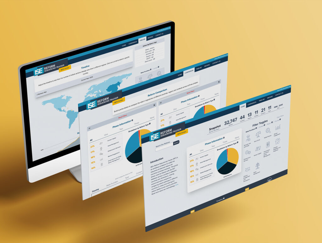
Top Shelf Design was hired to create an interactive “sandbox” dashboard for the ISE audience to play with and create their own unique set of search criteria. This portal allows users to interact with the RST database across a number of different countries and dimensions, viewing overall end reform sequences, comparing reform pathways in different countries or crises and viewing the reform details across country priorities.
Notable Website Features
- Custom dashboard visual tool which allows users to create their own search filters and data results to allow for unique discoveries via ISE’s recorded data.
- This specific site tool was also designed to be tablet-friendly since that was ISE’s chosen method of presenting this tool to their in-person prospects.

EmployIndy
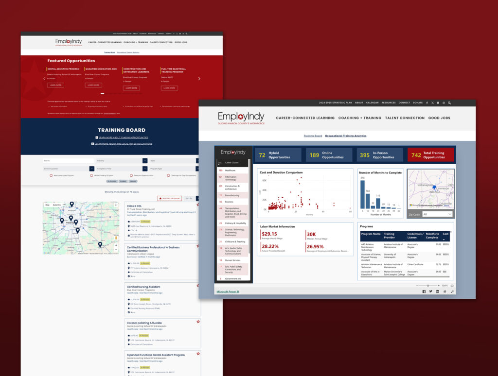
TSD created a user-friendly platform for the EmployIndy site that allows users to easily find training opportunities and explore relevant data. TSD designed a training board with a robust search function and filters that allow users to narrow results by program name, industry, completion time, cost, program type, and location (in-person, hybrid, and online). Search results are displayed on an interactive map, and users can view details such as program descriptions, cost, location, type of certification, and requirements.
The analytical page is a data dashboard that transforms raw data into compelling visuals, enabling users to easily view and analyze information on training opportunities across various career clusters. Users can engage with data and identify trends across a range of variables.

KEI
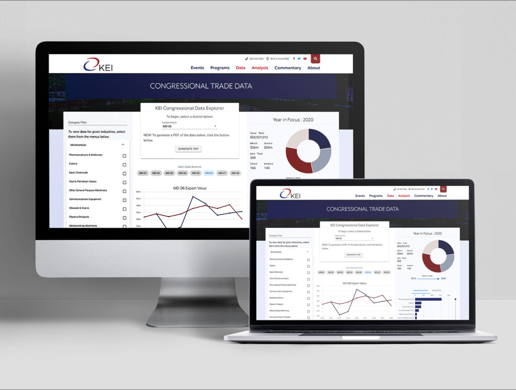
Top Shelf Design was hired to create an interactive “sandbox” dashboard for the ISE audience to play with and create their own unique set of search criteria. This portal allows users to interact with the RST database across a number of different countries and dimensions, viewing overall end reform sequences, comparing reform pathways in different countries or crises and viewing the reform details across country priorities.
Notable Website Features
- Ability for users to create the layout of locations and trades that are most pertinent to them and their current cause.
- TSD also created the rest of the KEI website in a previous project scope.
- TSD provided a designed PDF template which was used to create the downloadable one-pages that KEI employees use on a daily basis.

TAUC Labor Survey
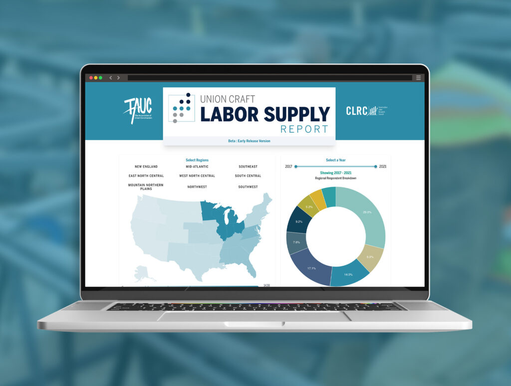
TAUC partners with CLRC, a construction industry data processing firm, to produce an annual report on the state of the Construction Trades as a value-add for their member organizations. This data is very dense, as the information involves a national survey with hundreds of respondents, who are all providing feedback on hundreds of questions. CLRC compiles the information into a large series of trend-based information and draws inferences, and we were contracted to build the companion piece, an online dashboard that would allow users access to the raw feedback. The value here is that the survey is too wide ranging to provide individualized feedback, so this tool allows people to narrow down the responses to just display their thin slice of survey result.
Notable Website Features
- Sorts through over one million data points over one million data points to compile graph information.
- Operates entirely on free-tier hosting.
- Collaborated with client’s external data firm vendor within a tight deadline.
